Benne: Making data actionable
Industry
Hospitality
Timeline
Jul 2025 - Sept 2025
Organization
Benne - Heritage Bangalore Dosa
My Role
Business Intelligence Lead
Team
Chief Growth Officer, Head of Operations, 1 intern
Type
Live project
Description
Benne's sales, inventory, customer feedback and operational data lived across various disconnected sources. The challenge was to bring this information together and make it useful for faster, more informed business decisions.
I designed and developed a comprehensive BI dashboard for Benne, collaborating closely with the Chief Growth Officer and Head of Operations. The dashboard consolidated key metrics across operations, sales, marketing & finance into a single source of truth, enabling faster, data-driven decision-making.
Note: All data displayed is dummy data & for demonstration purposes only.

The problem wasn't a lack of data
Benne had data across sales, inventory, operations and finance, but it was fragmented across different sources. Management had to manually piece together information to understand what was happening across the business.
The opportunity was to move from collecting data → understanding data → acting on it.
Understanding how different stakeholders use information
I spoke with stakeholders across management, operations and kitchen teams to understand what information they needed, how they currently accessed it, and where decision-making was getting blocked.

What I found from my research
Product performance was difficult to compare
Patterns of demand fluctuation were buried under raw data
Actual wastage and recorded wastage had discrepancies
There was no system to record and analyse customer feedback
Lack of consolidated visibility to the executives
Framing the stakeholder needs as business questions

After framing the business problems as questions, I plotted a path to go from these questions/problems to informed decisions using data.

Structuring the information
The dashboard needed to serve different levels of decision-making from an executive overview to detailed operational analysis. I structured the information into interconnected areas rather than treating every metric as an independent chart.

Raw datapoints used in each section
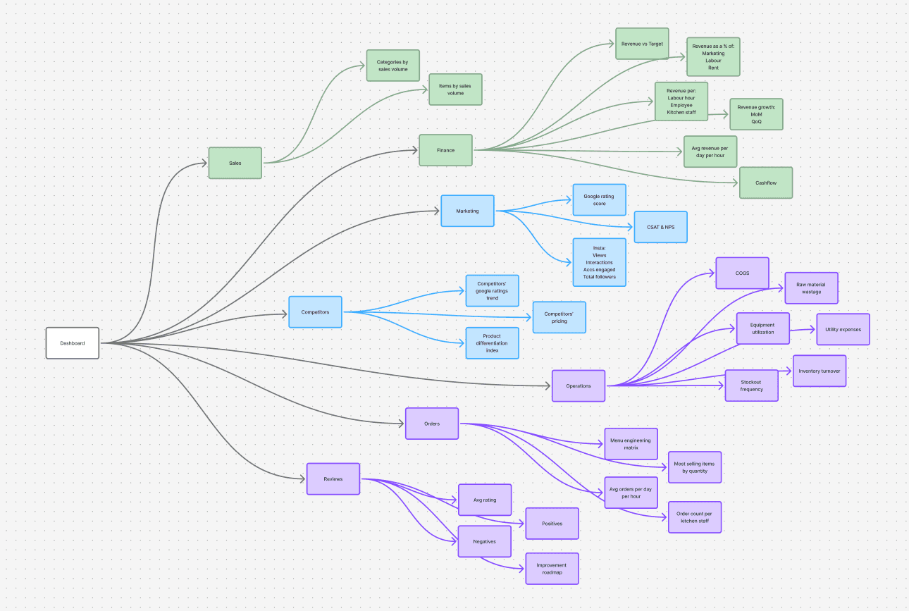
Metrics by section
From raw data to usable information
The required information wasn't available in a single clean dataset. I structured and transformed data from multiple sources before it could be visualized.

The following flow shows how I processed raw data to create a complex visualization- Average revenue per day per hour. Visualization is showed in the picture below.


In another example of transforming raw data, I used the n8n automation platform to create a new workflow, fetching the restaurant's google reviews and transforming them into actionable points using Gemini AI.


Finding patterns in the data
Question: Which products deserve more attention?
Visual: Menu Engineering Matrix scatter plot
High sales + high profit → Protect
Low sales + high profit → Promote / improve
Low sales + low profit → Remove

Insight: This matrix showed what actions needed to be taken regarding different products based on their demand and their contribution.
Why this visual: Two variables needed to be compared simultaneously, instead of two different graphs. The combined insight from these two datapoints added more depth to decision-making.
Question: When does demand peak and require more staffing?
Visual: Average orders per day per hour heatmap
Insight: The heatmap shows patterns of high demand clusters. These demand clusters suggest where staffing and preparation capacity matter most.
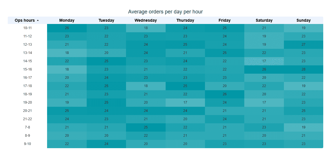
Why this visual: The severity of demand clusters across time-slots needed to be apparent visually. A heatmap was the perfect solution to visualize this. It helped the operations team allocate more resources in times of higher demand.
Question: How satisfied are customers with your service?
Visual: CSAT, NPS and Google review score line graphs
Insight: The trends of customer feedback metrics tell you how customers are rating you, aided by the review analysis which tells you what you're doing right and where you need to improve.

Why this visual: Showing trends tells us which direction the restaurant is headed. Are they improving or not? That's why a line graph showing trends was chosen in this case.
Note: All data displayed is dummy data & for demonstration purposes only.
Designing the dashboard
The final dashboard brought all these analytical views into a single decision-making system, moving from high-level performance to deeper investigation.

Dashboard metrics and logic

Dashboard pages

Impact that we had
Multiple functions like sales, marketing, finance & operations consolidated under a single comprehensive dashboard.
Translated raw data into actionable insights that improved decision-making for CXOs and internal stakeholders.
Increased visibility into specific data points that traditional POS systems could not provide.
Helped executives get a better view of customer experience by analyzing online reviews through one central engine, giving them a chance to improve processes provide a better experience.